# Build your own component with custom code
> Show records with your own Handlebars template, CSS and JavaScript, with links, actions, pagination, search and filter tabs.
Source: https://tadabase.com/docs/pages/custom-component
Status: Verified Nov 17, 2026. Checked against the current product
The **Custom** component shows records with a layout you write yourself. You write an HTML template using Handlebars, and Tadabase fills in field values, links, action buttons, pagination and search.
Use it when none of the built-in data components gives you the layout you need.
## Before you start
The Custom component needs a plan that includes the Custom Component builder. On a plan without it, the component editor shows an upgrade button instead of **Update & Save**, and a page that already has a custom component shows a plan warning in its place in the live app.
Templates use Handlebars. You need to know some HTML; the helpers are listed in [Handlebars helpers for custom components](https://tadabase.com/docs/pages/custom-component-helpers).
## Add a custom component
1. **Add the component** In the page builder, add a component and choose **Custom**.
2. **Choose the type** Under **Choose a Data View Type**, pick **List**, **Details** or **Summary** (see the table below), then click **Next**.
3. **Choose the records** Under **Which records should this custom component display?**, pick a data table or a connection, then click **Customize**.
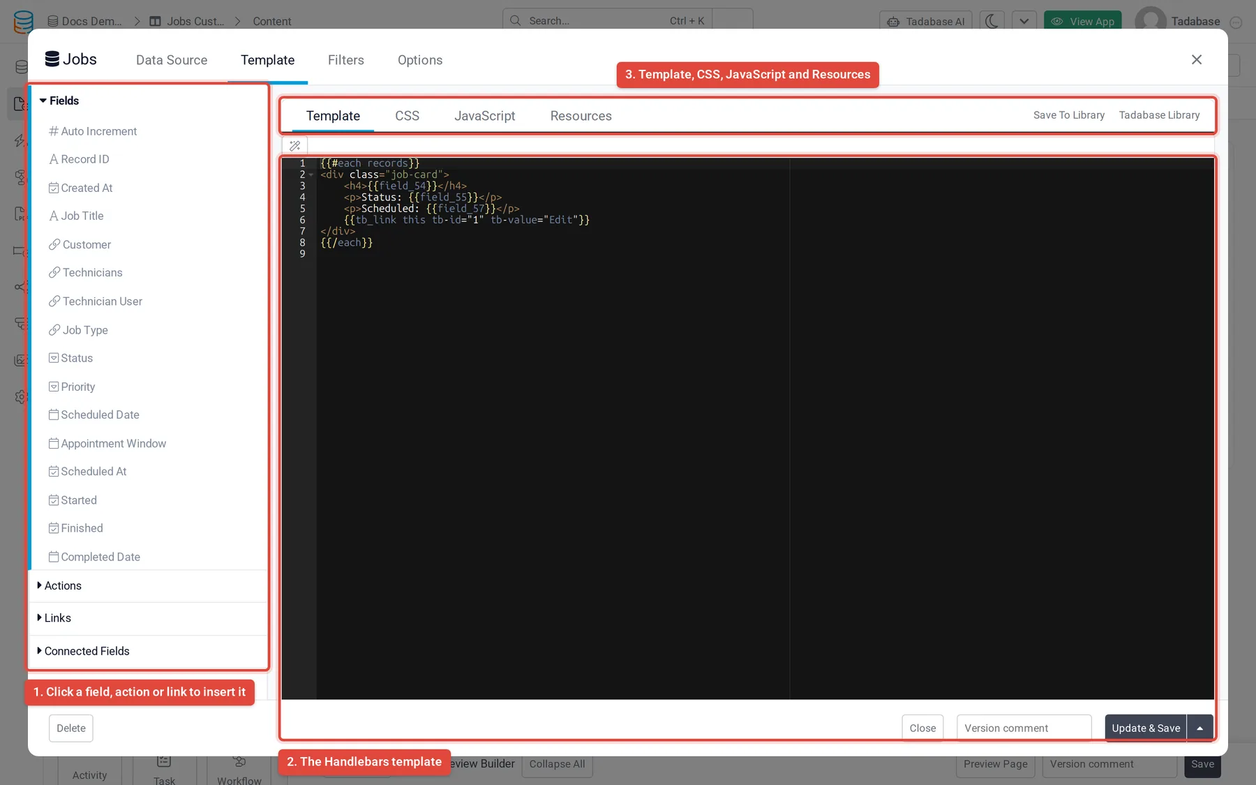
4. **Write the template** The editor opens on the **Template** tab. Click a field in the **Fields** list to insert it into the template at the cursor.
5. **Save** Click **Update & Save**. To save and close the editor, open the arrow next to it and choose **Update & Close**.
| Type | What it shows | Where it works |
| --- | --- | --- |
| **List** | Many records, one after another. Has filters, filter tabs, pagination and search. | Any page. |
| **Details** | One record. | A details page (a page that belongs to a record), or a record connected to the logged-in user. |
| **Summary** | Numbers calculated over the records: a count, minimum, maximum, average or sum. | Any page. |
## Write the template
A new List template starts with an `each` loop over `records`. Everything inside the loop repeats once per record. Inside the loop, a field is written as its field slug in double curly braces, and `{{id}}` is the record ID.
```html
{{#each records}}
{{field_100}}
Status: {{field_101}}
{{/each}}
```
Insert fields by clicking them in the **Fields** list. Clicking a field also tells Tadabase to load that field's value. A field you type by hand loads when it appears on its own, like `{{field_100}}`, but a field you only use inside a helper or block, like `{{#if field_37}}`, may come back empty. Click it once in the **Fields** list so it loads; you can delete the inserted text afterwards.
> **Fields that contain HTML:** Double braces show HTML as plain text. Use triple braces for a field whose value is HTML, such as `{{{field_39}}}`. Address and Rich Text fields are inserted with triple braces for you.
Fields from connected tables are in the **Connected Fields** list, and values returned by pipes on the component's data source are in the **Pipe Fields** list. Clicking one inserts a `tb_connected_val` or `tb_pipe_val` helper; keep its parameters as inserted.
## Fields with several parts
Some fields store more than one value. `{{field_39}}` shows the whole value; to show one part, put `obj.` in front of the field slug and add the part's name.
| Field | Parts |
| --- | --- |
| Name | `{{obj.field_39.title}}`, `{{obj.field_39.first_name}}`, `{{obj.field_39.middle_name}}`, `{{obj.field_39.last_name}}` |
| Address | `{{obj.field_40.address}}`, `{{obj.field_40.address2}}`, `{{obj.field_40.city}}`, `{{obj.field_40.state}}`, `{{obj.field_40.zip}}`, `{{obj.field_40.country}}`, `{{obj.field_40.lat}}`, `{{obj.field_40.lng}}` |
| Link | `{{obj.field_46.link}}`, `{{obj.field_46.text}}` |
To see every part of a field, such as a File, Image or Attachments field, print it with the `json` helper while you build, then remove it:
```html
{{#each records}}
{{json obj.field_44}}
{{/each}}
```
A field that holds a list, such as Attachments, can be looped with its own `each`: `{{#each obj.field_45}} ... {{/each}}`.
## Show summary values
A Summary component calculates values over its records. Set them on the **Data Source** tab, under **Calculation**.
1. **Pick the function** In each row, choose a **Formula Function**: **Count Record**, **Minimum Value**, **Maximum Value**, **Average Value** or **Sum Value**.
2. **Pick the field** For anything but a count, choose the number field in **Field**.
3. **Name the value** **Field Name** is the name you use in the template. The first row is called `total`. Click **Add Row** for more values, and **Add New Condition** to count only some records.
The Summary template starts like this; each value is written by its **Field Name**:
```html
{{#each records}}
{{total}}
{{/each}}
```
## Add links and action buttons
The **Links** list adds **Edit Link**, **Delete Link**, **Record Details Page**, **Connected Page** (when the table has connected pages) and **Record History**. The **Actions** list adds buttons that run an action on the record, such as **Update this record**, **Insert a new record**, **Send an Email** or **Send a Text Message**.
Clicking one inserts a helper with a number, such as `{{tb_link this tb-id="1"}}`, and adds the link to the list above the template, where the pencil button opens its settings. The number connects the helper to those settings, so keep `this` and the `tb-id` as they are.
What the helper outputs depends on the link:
- Edit, details and connected page links output only the page address unless you give them a `tb-value`. Put them inside an `href`: `Edit`.
- With a `tb-value`, the same helper outputs a complete link with that text: `{{tb_link this tb-id="1" tb-value="Edit"}}`.
- Delete links and action buttons always output a complete link. Do not put them inside an `` tag: `{{tb_link this tb-id="4" tb-value="Mark done" class="btn btn-primary"}}`.
| Parameter | What it does |
| --- | --- |
| `tb-value="Text"` | The link text. |
| `tb-icon="fa fa-pencil"` | Adds an icon before the text. |
| `tb-open-popup="1"` | Opens an edit or details page in a pop-up instead of going to it. Needs `tb-value`. |
| `tb-open-popup-title="Text"` | The pop-up's title. Without it, the link text is used. |
| `tb-only-link="1"` | Outputs only the address, even when `tb-value` is set. |
| `class`, `id`, `style` and other attributes | Added to the link as written. |
```html
{{tb_link this tb-id="3" tb-value="View job" tb-open-popup="1" tb-open-popup-title="Job details" class="btn btn-default"}}
```
## Add pagination, search and filter tabs
A List component has the usual controls on its **Options** tab: **Show Action Bar** (on by default), **Enable Search**, **Show Pagination**, **Show Filter Tab** and **Record Limit** (records per page, 10 by default). To place your own controls inside the template instead, use these helpers. Each accepts `tb-value` for its text, `tb-icon` for an icon, and attributes such as `class`.
| Helper | What it does |
| --- | --- |
| `{{tb_load_more tb-value="Load More" class="btn btn-primary"}}` | Loads the next page of records below the current ones. |
| `{{tb_pagination tb-type="next"}}` | Goes to another page. `tb-type` is `next`, `prev`, `first`, `last` or a page number. |
| `{{tb_refresh tb-value="Refresh"}}` | Reloads the records from the first page. |
| `{{tb_search_input}}` | A search box. Pressing Enter searches. |
| `{{tb_search_submit tb-value="Search"}}` | A button that searches for the text in the search box. |
| `{{tb_search_clear tb-value="Clear"}}` | Empties the search box and shows all records again. |
| `{{tb_filter tb-id="1" tb-value="Open jobs"}}` | Applies a filter tab. `tb-id` is the tab's position on the **Filters** tab: 1 for the first tab, 2 for the second. |
| `{{tb_filter_clear tb-value="All jobs"}}` | Removes the filter tab that is applied. |
These values are available anywhere in the template, outside the `records` loop:
| Value | Contains |
| --- | --- |
| `{{tb_current_page}}` | The page being shown. |
| `{{tb_total_pages}}` | The number of pages. |
| `{{tb_total_records}}` | The number of records that match. |
| `{{tb_current_records}}` | The number of records shown now. |
| `tb_is_first_page`, `tb_is_last_page` | True on the first or last page, for use in `{{#if}}` or `{{#unless}}`. |
| `{{searchText}}` | The text being searched for. |
```html
{{#unless tb_is_first_page}}{{tb_pagination tb-type="prev" tb-value="Previous"}}{{/unless}}
Page {{tb_current_page}} of {{tb_total_pages}}
{{#unless tb_is_last_page}}{{tb_pagination tb-type="next" tb-value="Next"}}{{/unless}}
```
To create filter tabs, open the **Filters** tab, turn on **Filter Tabs** and click **Add New Tab**. Filters that always apply go on the **Data Source** tab, under **Filters**; see [Data source filtering](https://tadabase.com/docs/pages/data-source-filtering).
## Add CSS, JavaScript and outside files
Next to **Template**, the editor has three more tabs:
- **CSS**: styles added to the page with the component.
- **JavaScript**: code that runs each time the component renders its records, including after paging, searching and refreshing. An error in it is written to the browser console and does not stop the page.
- **Resources**: links to outside JavaScript or CSS files. Click **Add New Resource**, choose **Javascript** or **CSS**, and enter the full URL.
**Tadabase Library**, above the template, opens ready-made templates you can load into the component.
## Common problems
| Problem | Fix |
| --- | --- |
| A field shows nothing. | Click the field once in the **Fields** list so its value loads, then check that the slug in the template matches. |
| HTML shows as text. | Use triple braces: `{{{field_39}}}`. |
| A link shows its address as text. | Put the helper inside `href="..."`, or give it a `tb-value` so it outputs a complete link. |
| The component shows nothing at all. | A helper may have stopped the template, for example a text helper given a field that is not loaded. Open the browser console to see the error, and wrap the helper in `{{#if field_100}} ... {{/if}}`. |