
Customize Pagination Colors
Please note that this is now available as a plugin for easier installation. While you can use this document as a reference, the recommended method to add…
- Not yet re-checked
- Classic builder
Moved from our previous help site and not yet re-checked against the current product. Last edited Sep 20, 2024.

This CSS method can be applied to a page to customize the colors of the pagination buttons that appear within data components such as tables or lists. You can use the code to modify the color attributes of the pagination elements, including the background, border, and text colors.
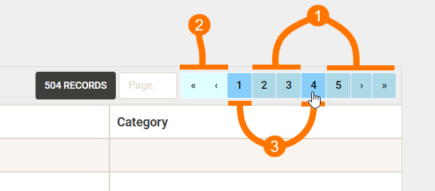
The image below corresponds to the CSS in that each snippet will change the attributes of a specific button state. The various states can be defined as follows:
- Default (not active/hover or disabled)
- Disabled
- Active or hover
One Easy Step
Add the following code to the CSS tab of your page.
/* (1) Change buttons (excluding active or disabled)*/
.pagination>li>a {
    background-color: #ADD8E6;
    border-color: #F0F8FF;
    color: #000000;
}

/* (2) Change disabled buttons*/
.pagination>.disabled>a,
.pagination>.disabled>a:hover,
.pagination>.disabled>a:focus {
    background-color: #E0FFFF;
    border-color: #F0F8FF;
    color: #000000;
}

/* (3) Change active or hover button color*/
.pagination>.active>a,
.pagination>.active>a:hover,
.pagination>.active>a:focus,
.pagination>li>a:hover,
.pagination>li>a:focus {
    background-color: #87CEFA;
    border-color: #F0F8FF;
    color: #000000;
}
Original Community Post:
Customize Pagination Colors with CSS - Community Discussions / Tips and Tricks - Tadabase Community
Was this page helpful?
Something wrong or missing on this page? Tell us.