
Mobile Menu Logo - When Menu is Closed
Please note that this is now available as a plugin for easier installation. While you can use this document as a reference, the recommended method to add…
- Not yet re-checked
- Classic builder
Moved from our previous help site and not yet re-checked against the current product. Last edited Sep 20, 2024.
Adding customization to a menu logo can significantly help the user experience for mobile users. Here is how to get this done.
Step 1
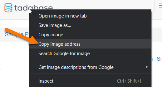
Get the Image Address or “URL.” If viewing an image on a webpage, you can copy it by right-clicking and selecting the “Copy image address” option.
Step 2
Add the following to the JavaScript tab of the Layout where the menu is located.
var imageUrl = '//res.cloudinary.com/tadabase/image/upload/v1592348737/client/tutorials/logo_twohh9.png';
var image = $('<img class="custom-menu-image" src="' + imageUrl + '">');
$('.navbar.navbar-default').prepend(image);Step 3
Add the following code to the CSS tab of your Layout.
.custom-menu-image {
    width: 150px;
    position: relative;
    margin-right: 15px;
    padding: 9px 10px;
    margin-top: 8px;
    margin-bottom: 8px;
}

@media (max-width: 768px) {
    .menu-item-img {
        display: none;
    }
}

@media (min-width: 768px) {
    .custom-menu-image {
        display: none;
    }
}
Original Community Post:
https://community.tadabase.io/t/mobile-menu-logo-when-the-menu-is-closed/1349
Was this page helpful?
Something wrong or missing on this page? Tell us.