
Checkbox, Radio, Select, Multi-Select and Decision Box fields
Let people pick from a fixed list with Checkbox, Radio, Select and Multi-Select fields, or answer yes or no with a Decision Box. Add, order and color the options.
- Verified Nov 17, 2026
- Classic builder
On this page
Option fields let people choose from values you set up in advance, so everyone spells a status or category the same way. The Option group of the field menu has five types: Checkbox, Radio, Select, Multi-Select and Decision Box.
Which type to use #
| Type | People can pick | Shown on forms as | Icon per option |
|---|---|---|---|
| Checkbox | Several options | A checkbox for each option | Yes |
| Radio | One option | A radio button for each option | Yes |
| Select | One option | A drop-down list | No |
| Multi-Select | Several options | A list where several options can be selected | No |
| Decision Box | Yes or no | A checkbox, two radio buttons or a drop-down | No |
Use Radio or Select for one status per record, such as a job's stage. Use Checkbox or Multi-Select when several values can apply, such as the services on a job. Use a Decision Box for a single yes-or-no question, such as "Accept terms".
Add an option field #
- Open the table In the Data Builder, open the table and go to its Fields tab.
- Pick the type Click Add New Field, then under Option click the type you want.
- Configure it Click Add and Configure, enter a Name, set up the options as described below, and click Save.
Set up the options #
Checkbox, Radio, Select and Multi-Select fields share the Options list:
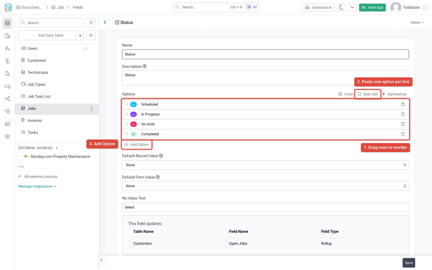
- Click Add Option for a new row and type the option's text. The trash icon removes a row.
- Drag the grip handle at the left of a row to change the order. Forms list the options in this order.
- Click Alphabetize to sort the list from A to Z.
- Click Bulk Edit to type or paste the whole list at once, one option per line. Click Bulk Edit again to go back to the rows.
- Tick Color to give each option a color badge, then pick a color for each row. The badge is shown wherever the value is displayed. New option fields start with Color ticked.
- On Checkbox and Radio fields, each row also has an icon picker for an icon next to the option.
Default values #
| Setting | What it does |
|---|---|
| Default Record Value | One of your options, saved when a new record is created with this field left blank. Existing records are not changed. |
| Default Form Value | One of your options, already selected when a form with this field loads in the live app. |
| No Value Text | Select fields only. The text shown in the drop-down before anything is picked. New fields use Select. |
Decision Box settings #
A Decision Box stores a yes-or-no answer. It has no options list; instead you choose how the question looks:
| Setting | What it does |
|---|---|
| Input Type | Checkbox (default), Radio Buttons or Drop-down. |
| Label | Checkbox only. The text beside the checkbox, such as I agree to the terms. New fields start with Decision Box. |
| Labels | Radio Buttons and Drop-down only. The pair of answers: Yes/ |
| Default Form Value | Unchecked (default) or Checked when a form loads. |
Change options on a field that has data #
Records store the option's value, not a link to the option. Renaming or removing an option in the field settings does not change records that already hold it: they keep the old value, which no longer matches any option and is missed by filters on the new one.
- Add the new option Add the new option and save the field, but keep the old one for now.
- Move the records On the table's Records tab, filter to the records with the old value and use Batch Operations > Update to set the new one.
- Remove the old option When no records use it any more, remove the old option and save.
Was this page helpful?
Something wrong or missing on this page? Tell us.