
Change colors and hide values with display rules
Add display rules to a column or field of a table, list, details or other data component to color, style, mark with an icon or hide its value.
- Verified Nov 17, 2026
- Classic builder
On this page
A display rule changes how one value looks on the live page when its conditions are true: red text for an overdue date, a check icon for a finished job, or no Edit link on a closed record. It changes only what users see, never the stored data.
Forms have their own display rules, which show or hide inputs; see Form rules.
Where you can add them #
Display rules are set per column or field, in the field's settings window, on the Display Rule tab. That tab is there for the columns and fields of tables, lists, kanbans, accordions, timelines and details components. It is not offered for the fields of calendars, resource components, maps or pivot tables, and it is hidden on PDF pages.
Rules work on link columns too, so you can hide an Edit link or color a button. See Add edit, details and other record links.
Add a display rule #
- Open the field's settings Edit the component, open the tab that lists its columns or fields (Columns on a table, Fields on a list or details component) and click the column or field. On a table, click the column's heading.
- Open the Display Rule tab Click Display Rule, then Add New Rule.
- Set the conditions Choose a field, an operator and a value, as in data source filters. Click Add Another Condition to add more.
- Choose what happens Under Action, pick an action from the list. Click Add New to add a second action to the same rule, for example a color and an icon.
- Save Click Update in the field's window, then Update & Save in the component's window.
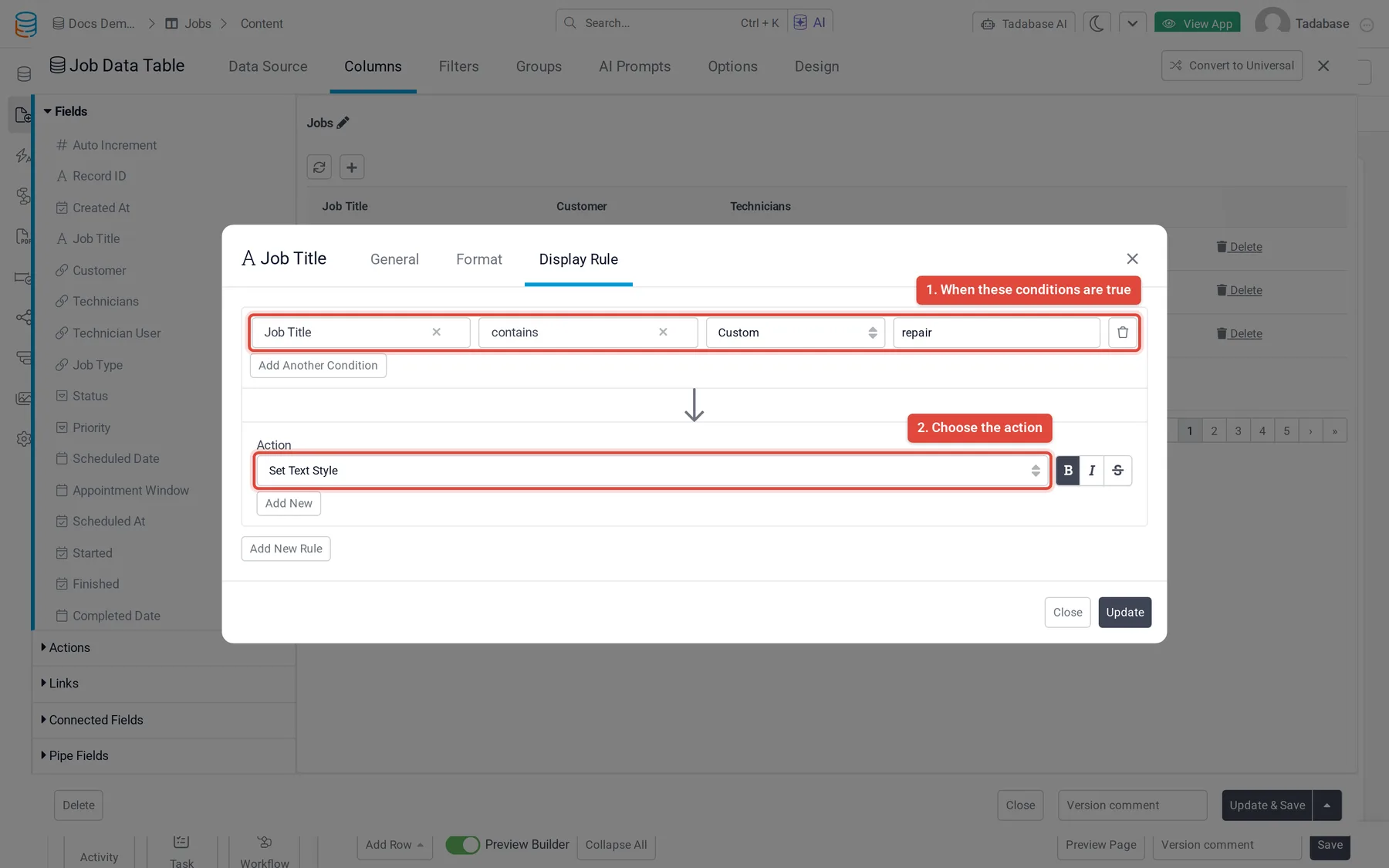
A rule applies when all of its conditions are true. To get the same result when any one of several conditions is true, add a separate rule for each condition. Click Add New Rule again to add as many rules as you need on one column.
Actions #
| Action | What it does |
|---|---|
| Set Text Color | Shows the value in the color you pick. |
| Set Text Style | Makes the value bold, italic or struck through. Click one or more of the three style buttons. |
| Set Background Color | Fills the cell or field area behind the value with the color you pick. |
| Display Icon | Puts an icon before the value, in the color you pick. On a link, the icon goes inside the link. |
| Hide Value | Hides the whole value, including a link or button. |
| Hide Text Value | Hides the text but keeps an icon added by Display Icon, so the cell shows only the icon. |
Example: on a Scheduled Date column, add a rule with Scheduled Date is before today and Status is not Completed, then add Set Text Color red and Display Icon with a warning icon. Overdue open jobs now stand out in the table.
Conditions #
Conditions compare the record's own values, with the same operators as data source filters, except that text fields have no is exact and connection fields have no logged-in user operators. See Filter conditions for each field type.
Was this page helpful?
Something wrong or missing on this page? Tell us.