
Show totals and counts on cards
Add a Card that shows one number from your records, such as a count, sum or average, with a header, footer, icon and link.
- Verified Nov 17, 2026
- Classic builder
On this page
A Card shows a single value on a page: a number you type, or a calculation over your records, such as the count of open jobs or the sum of unpaid invoices. Use cards for dashboard figures that people should see at a glance.
Add a card #
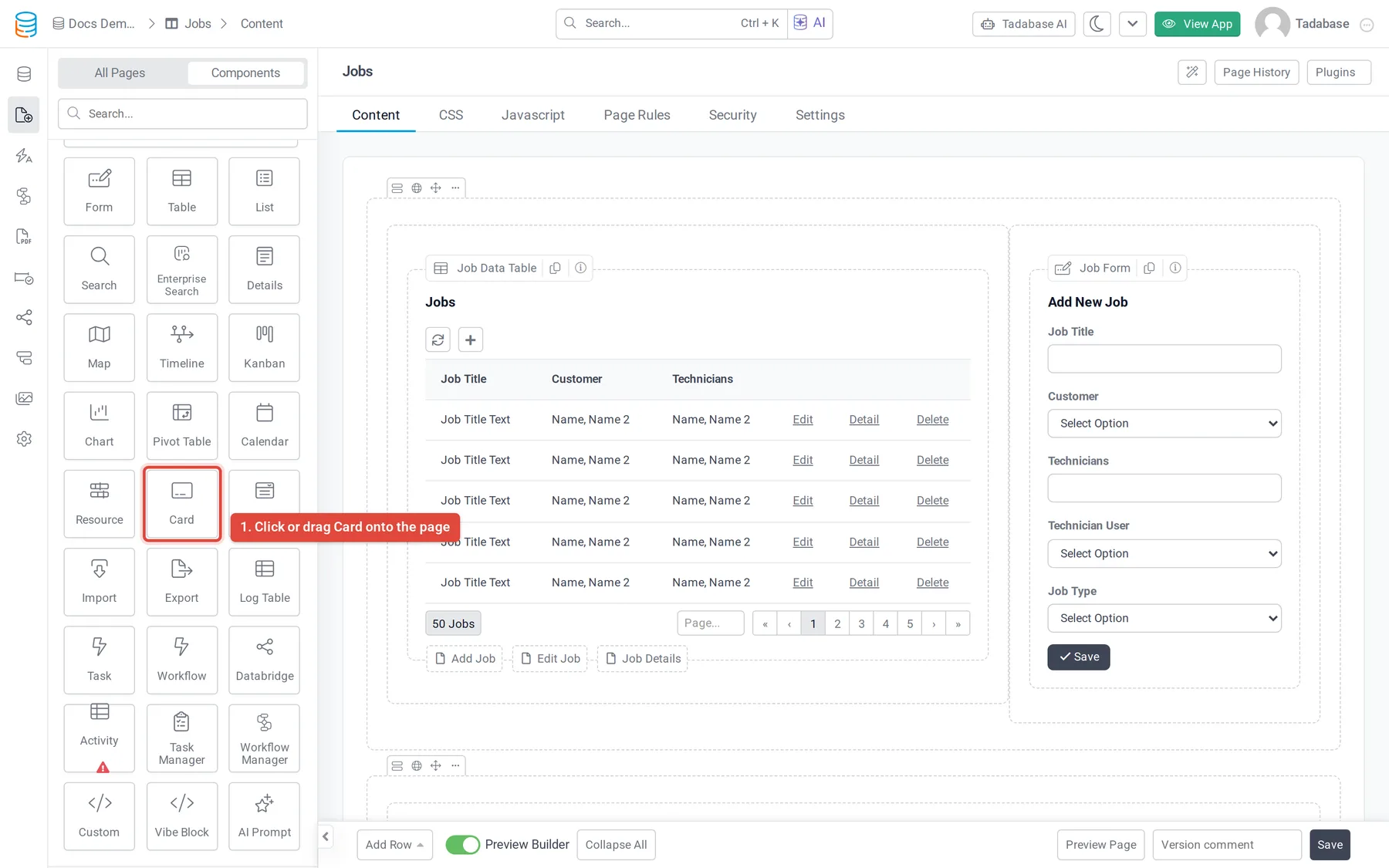
- Open the page In the Page Builder, open the page and its Content tab. Click the Components tab in the left panel.
- Add the Card Under Data Components, click Card or drag it into a column.
- Choose the records Answer Which records would you like to be used in the card? by selecting a table, or records connected to the page's record or to the logged-in user. See Choose which table and records a component shows.
- Customize it Click Customize to open the card's settings, or Quick Add to add it now and set it up later.
- Save Set the calculation and design (described below), then click Update & Close.
The settings window has five tabs: Data Source, Calculations, Card Options, Filters and Design.
Choose what the card shows #
On the Calculations tab, set Type:
- Static shows the text you type in Value. The card does not read any records.
- Formula calculates a value from the card's records. Pick the calculation in Formula Function.
| Formula Function | What it shows |
|---|---|
| Count Record | How many records match. |
| Minimum Value | The lowest value of the Value Field. |
| Maximum Value | The highest value of the Value Field. |
| Average Value | The average of the Value Field. |
| Sum Value | The total of the Value Field. |
Every function except Count Record needs a Value Field. The list offers number-type fields: Number, Currency, Rating, Auto Increment, Basic Formula, Complex Formula, Equation, and rollups that produce a number. Hidden fields are not listed.
Under Conditions, click Add New Condition to count or total only some records, for example only jobs whose status is Scheduled. The Data Source tab only shows which table and connection the card reads; narrowing the records is done here.
| Option | What it does |
|---|---|
| Auto Refresh | Shown for Formula. When on, the card reloads its value every 30 seconds while the page is open, which suits a dashboard on a wall screen. |
| Thousands Delimiter | Separates thousands with a Comma, Period or Space, or None. |
| Decimal Places | Rounds the value to 0, 1, 2 or 3 decimal places. |
Header, footer, icon and link #
The Card Options tab has a preview of the card on the right. Click a part of the preview, or one of the sections on the left, to change it.
| Section | Settings |
|---|---|
| Card Link | Link Type: Disable, Page (pick a page of your app) or Link (type a Link URL). Then Open In New Window, or Show in Popup with an optional popup header, Popup Title and popup footer. |
| Header | Title above the value, its Font Size, Alignment, Color and Background Color. |
| Footer | Title below the value, with the same font, alignment and color settings. |
| Content | The value's Font Size, Prefix and Suffix (for example $ or %), Alignment, Color, Background Color, a Tooltip and Show Tooltip Icon. |
| Border | Which sides have a border (Position), its Color, Width and Radius, and the Shadow Depth of the card (No to 5x). |
| Icon | Turn on Visible, pick the Icon, its Size, Alignment (left, top, right or bottom of the value) and Default color. |
Under Icon, Color Rules change the icon and its color based on the value. Click the rules button, then Add New Color Rule, and set a color, an icon, a comparison (equal to, not equal to, higher than or lower than) and a value. For example: higher than 25000 shows a green smile.
Filter tabs and design #
- Filters: turn on Filter Tabs to show tabs above the card. Each tab has its own conditions, and the card recalculates for the tab people click. Hide Clear Filter Tab removes the tab that clears the filter.
- Design: change the component's fonts, background, border, spacing and CSS. See Change how your app looks.
Cards on PDF pages #
Card is also listed under Data Components when you build a PDF page. On a PDF page the card has no Filters tab, no Card Link and no Auto Refresh, because the PDF is a printed document. See PDF pages.
Check that it works #
Open the page in your live app. The card shows the value calculated from the records its data source covers. If it shows 0, check which records you chose when adding it, the Conditions, the selected filter tab and, for sums and averages, that the Value Field has values.
Was this page helpful?
Something wrong or missing on this page? Tell us.