
Show records in collapsible accordion rows
Add an Accordion that lists records as headings people click to open, such as FAQs, and choose the fields shown inside each panel.
- Verified Nov 17, 2026
- Classic builder
On this page
An Accordion lists records as a column of headings. Clicking a heading opens a panel with that record's details, and clicking it again closes it. It suits questions and answers, help topics and other lists where people read one item at a time.
Add an accordion #
- Open the page In the Page Builder, open the page and its Content tab. Click the Components tab in the left panel.
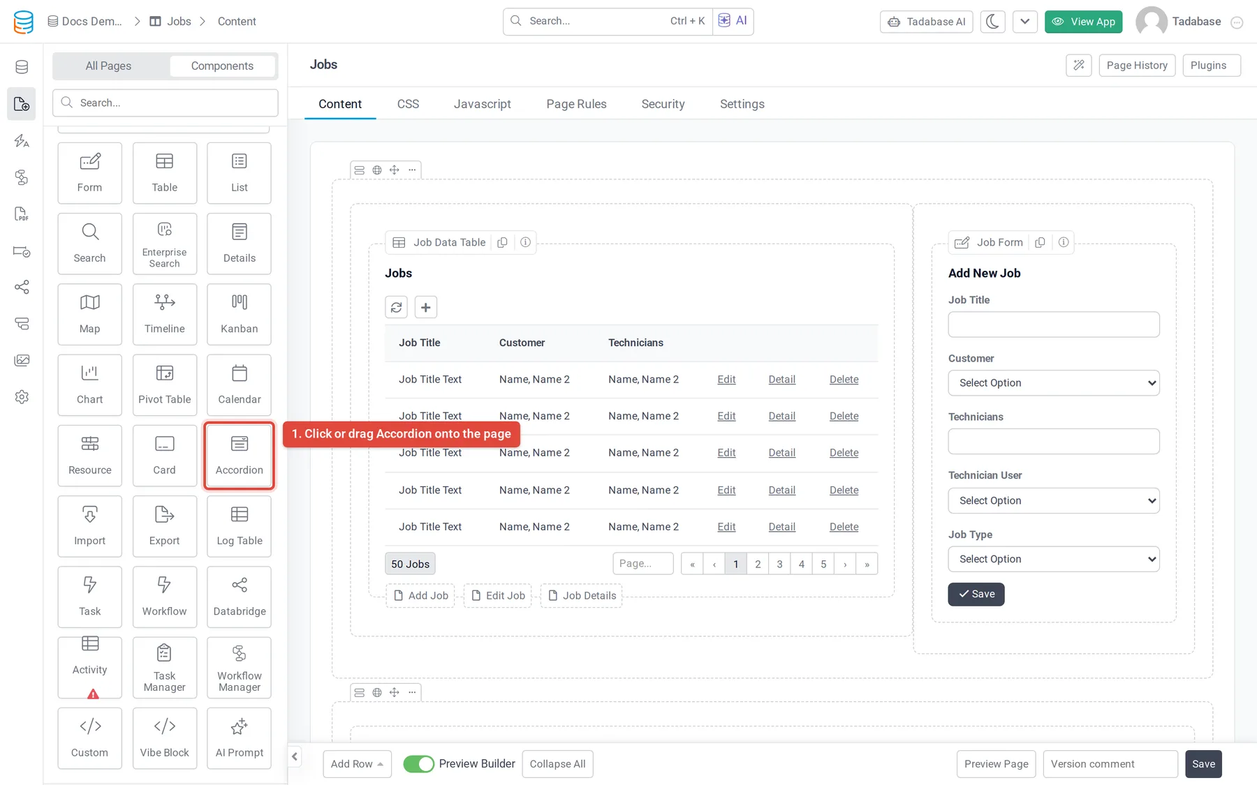
- Add the Accordion Under Data Components, click Accordion or drag it into a column.
- Choose the records Answer Which records should this list display? by selecting a table, or records connected to the page's record or to the logged-in user. See Choose which table and records a component shows.
- Quick Add or Customize Click Quick Add to add it with default settings, or Customize to choose the heading and fields first.
- Save Click Update & Close.
The settings window has six tabs: Data Source, Fields, Filters, Accordion Design, Options and Design.
Choose the heading and the panel content #
On the Fields tab:
- Accordion Heading Field is the field shown as each record's clickable heading, for example a Question field.
- The area below it is the panel that opens. Click fields on the left to add them, and arrange them in rows and columns the same way as in a list. You can also add Links (Edit Link, Delete Link, Record Details Page, Connected Page) and fields from connected tables under Connected Fields.
Accordion options #
| Option | What it does |
|---|---|
| Title | A title shown above the accordion. |
| Description | A short text shown under the title. |
| Accordion Layout | Puts the records in 1 Column, 2 Columns, 3 Columns, 4 Columns or 6 Columns. |
| No Records Found Text | Text shown when there are no records. |
| Record Limit | How many records show per page: 10, 25, 50, 100 or All. |
| Add Line Between Records | Adds a horizontal line between records. |
| Allow Only Single Panel Opened | Opening one panel closes any other open panel. |
| Enable Inline Editing | Lets people edit field values in place. See Inline editing. |
Sort and filter the records #
- Data Source > Data Table: set Sort By (add more with Add New Sort Field) and Limit Records (All Records or Limited Records).
- Data Source > Filters: click Add New Filter Group to show only some records. See Choose which records a component shows.
- Filters: turn on Filter Tabs to show tabs above the accordion that people click to filter it. Hide Clear Filter Tab removes the tab that clears the filter.
Style the accordion #
The Accordion Design tab styles the headings and panels. Several settings have a Selected version that applies while a panel is open.
| Section | Settings |
|---|---|
| Title | Font Size, Alignment, Color, Icon, Selected Color and Selected Icon of the heading. |
| Content | Font Size, Alignment, Color and Padding of the panel. |
| Border | Position, Color, Selected Color, Width and Radius. |
| Element | Background Color, Selected Background Color and Margin of each record. |
| Shadow | Depth and Selected Depth, from No to 5x. |
The separate Design tab sets the whole component's fonts, background, border, spacing and CSS. See Change how your app looks.
Was this page helpful?
Something wrong or missing on this page? Tell us.