
Add a navigation menu
Add a Menu component with links to pages, websites, images and login or logout links, then set alignment, icons, child items and menu style.
- Verified Nov 17, 2026
- Classic builder
On this page
The Menu component is a navigation bar for your app. Each item can open a page, open a website, show text or an image, or give people a login, sign-up, profile or logout link. Put the menu in a layout so every page that uses the layout shows it.
Add a menu #
- Open the layout or page In the Page Builder, open the layout (or page) that should show the menu. Its Content tab opens.
- Pick a spot In an empty column, click Add Component. You can also drag the component from the left panel straight into a column.
- Choose Menu On the Components tab of the left panel, under System Components, click Menu. The menu's settings window opens on the Menu Items tab.
- Add the items Click Add New Item for each link. See the next section.
- Save Click Update & Save. To keep working on the page without saving it yet, open the arrow next to it and choose Update & Close.
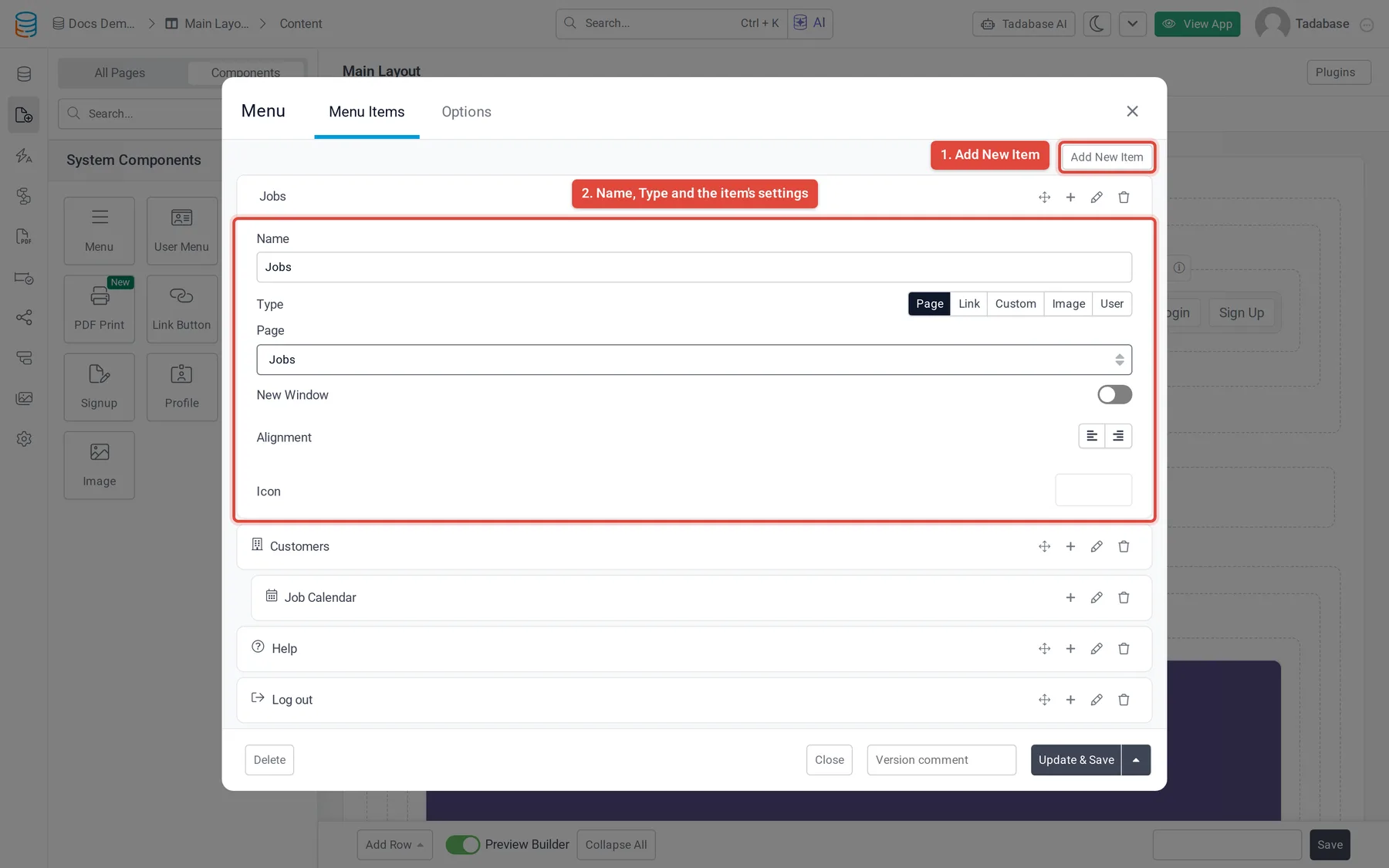
Add and edit menu items #
- Add an item Click Add New Item. A new item opens below the list.
- Name it Type the text people see in the menu in Name.
- Choose its type Under Type, choose Page, Link, Custom, Image or User. New items start as Page. The settings below change with the type.
- Finish the item Fill the settings for that type (see the table), then set Alignment and Icon if you want them.
Click an item's name to open or close its settings. Each item also has buttons to Drag it to a new position, add a sub item, Edit it and Delete it.
Menu item types #
| Type | What it shows | What to set |
|---|---|---|
| Page | A link to a page in your app. | Pick the page under Page. |
| Link | A link to a web address, for example your website or a help page. | Enter the address in Link URL. |
| Custom | Text that is not a link, such as a slogan next to your logo or a separator. | Write it in the Text editor. You can format it and use app variables such as {!currentDate!}. |
| Image | A picture, such as your logo. It can also be a link. | Add the picture under Image. To make it a link, enter an address in Link URL. |
| User | A login, sign-up, profile or logout link that shows or hides depending on whether the person is logged in. | Choose Login, Sign Up, Profile or Logout under User Link. |
Login, sign-up, profile and logout links #
A User item only appears when it makes sense for the person looking at the app:
| User Link | Shown to | Opens |
|---|---|---|
| Login | People who are not logged in | Your app's login page |
| Sign Up | People who are not logged in | Your app's sign-up page |
| Profile | Logged-in users | Your app's profile page |
| Logout | Logged-in users | Logs the user out, then sends them to a page (see below) |
If you would rather have one ready-made login and account menu, use the User Menu component instead.
Choose where people go after logging out #
A Logout item has Logout Redirect Rules. Without rules, people go to your app's login page after they log out.
- Add a rule Under Logout Redirect Rules, click Add New Rule.
- Choose the role In If Role is, choose a role, or All Users.
- Choose the page In Then redirect to, choose a page, or App Home Page.
A rule for one of the user's roles wins over an All Users rule. If no rule matches, the user goes to the login page. Click Remove Rule to delete a rule. See User roles.
New window, alignment and icons #
| Setting | What it does | Default |
|---|---|---|
| New Window | For Link and Image items, Yes opens the address in a new browser tab. Not shown for User items. | No |
| Alignment | Left or right. Right-aligned items sit at the right end of the menu bar. | Left |
| Icon | An icon shown before the item's name. Pick one from the icon list. | None |
Add child items (drop-downs) #
To put items in a drop-down under another item, click the + button (Add New Sub Item) on the parent item. The child item has the same settings as any other item. A parent can have several child items, and a child item can have its own child items.
In the live app, the child items open as a drop-down under the parent item.
Rename the menu and change its style #
Open the Options tab of the menu's settings window:
| Setting | What it does | Default |
|---|---|---|
| Menu Name | The name you see in the builder. It cannot be empty. Give each menu a clear name so you can find it later. | Menu 1, Menu 2 and so on, in the order the menus were made |
| Menu Style | Horizontal shows the items in a row; Vertical stacks them. | Horizontal |
The menu name matters when you create a page: after you choose a layout, Add Page to Existing Menu lists your menus by name and adds a link to the new page to the menu you pick.
Change or remove a menu #
Click the menu in the Page Builder to open its settings again. To remove it, click Delete at the bottom left of the settings window.
Was this page helpful?
Something wrong or missing on this page? Tell us.