
Show records as a list or gallery
Add a List component to show each record as a block of fields, in one column or a grid of up to six, with images, links, filter tabs and search.
- Verified Nov 17, 2026
- Classic builder
A List component shows each record as its own block of fields instead of a table row. Use it when records have a picture or longer text, such as a directory, a product gallery or a list of jobs with notes.
Add a list #
- Add the component In the Page Builder, open the page, click Add Component in an empty column and choose List under Data Components.
- Choose the records Answer Which records should this list display? See Choose which table and records a component shows.
- Quick Add or Customize Quick Add adds every field; Customize opens the settings so you pick them.
- Save Click Update & Save or Update & Close.
The settings window has these tabs: Data Source, Fields, Filters, Layouts, AI Prompts (when AI prompts are available in your app), Options and Design.
Add fields #
On the Fields tab, click an item on the left to add it to the record's block on the right. Arrange the block in rows and columns: hover over a row to add a column, and drag fields between them. The lists on the left are:
- Fields: the table's fields.
- Connected Fields: values from a connected record. Pick the connected table at the top of the list.
- Links & HTML: Edit Link, Delete Link, Record Details Page, Connected Page, Connected PDF, and HTML for your own text. See Links.
- Actions: buttons that act on the record, including Trigger Workflow for running a workflow; the other actions are the older action links that workflows replaced. See Table component.
- Pipe Fields: values from a pipe on the Data Source tab.
Click a field in the block to change its settings: its title, format, and a Display Rule to change its color or icon, or hide it, based on the record. They work the same way as table column settings; see Table component.
Choose the layout #
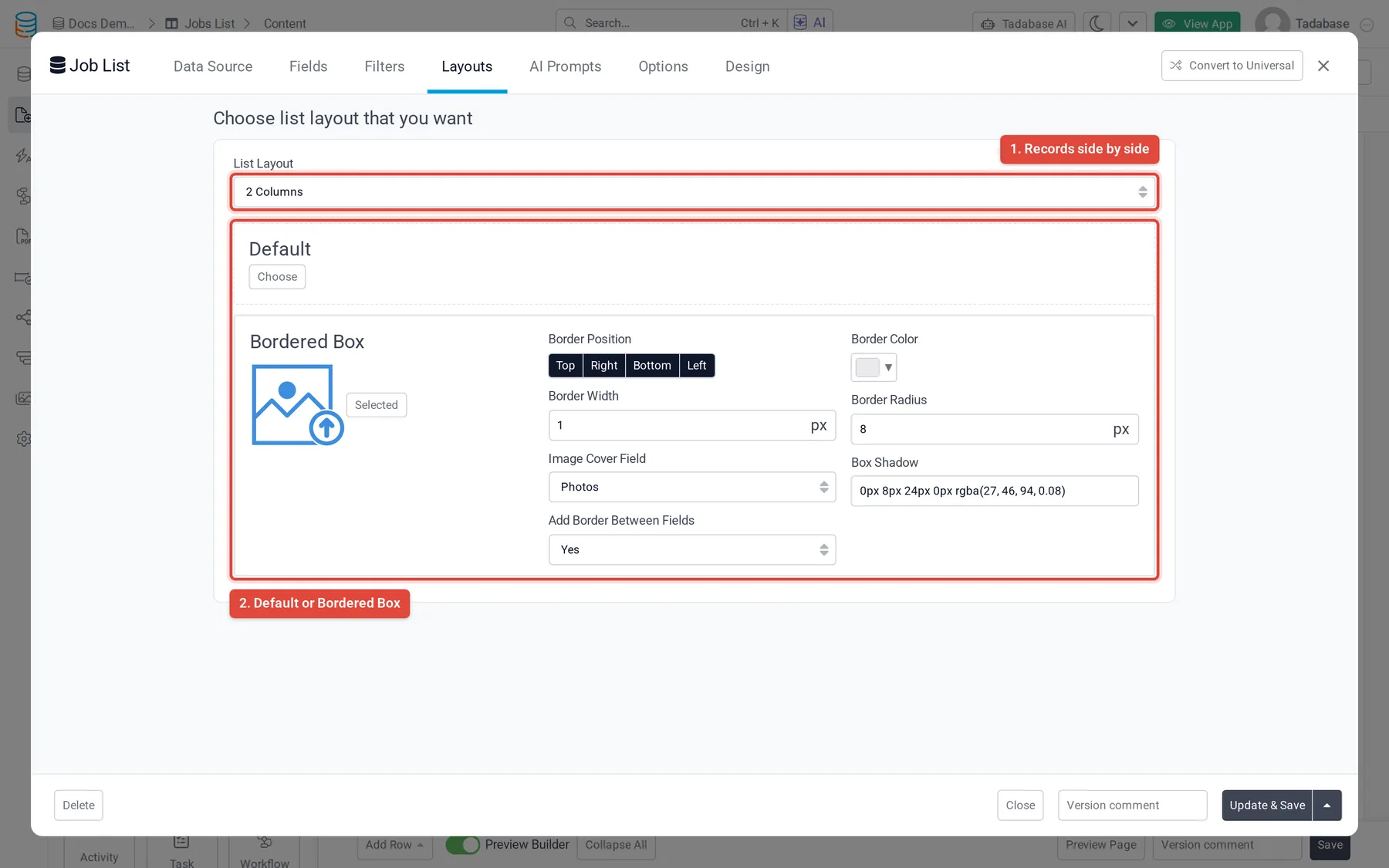
On the Layouts tab, List Layout sets how many records sit side by side: 1 Column for a list, or 2 Columns, 3 Columns, 4 Columns or 6 Columns for a gallery or grid. Below it, choose the style of each record's block:
- Default: the fields with no frame.
- Bordered Box: each record in a box. Set the Border Position, Border Width, Border Color, Border Radius and Box Shadow, choose an Image Cover Field to show a picture at the top of each box, and Add Border Between Fields if you want lines between the fields.
Records, filters and filter tabs #
The Data Source tab sets Sort By and Limit Records, and its Filters narrow the records for everyone; see Choose which records a component shows. The Filters tab adds Filter Tabs, buttons above the list that each show a subset of the records, set up the same way as on a table.
Options #
| Option (Options tab) | What it does |
|---|---|
| Enable Search | Adds a search box above the list. |
| Show Pagination, Pagination | Shows page links at the Top, Bottom, Top and Bottom, or hides them (Hide). |
| Record Limit | How many records the list shows. |
| Hide Empty Fields | Leaves out fields that have no value for a record. |
| Add Line Between Records | Draws a line between records. |
| No Records Found Text, Record Name | The text when nothing matches, and the singular and plural name used for the records. |
| Enable Inline Editing | Lets people edit values in place. See Inline editing. |
| Allow Export | Lets people download the records. |
Lists can also be added to PDF pages. There the Filters tab, links and action buttons are not available, and Limit Records offers All Records (Up to 250). See PDF pages.
Was this page helpful?
Something wrong or missing on this page? Tell us.