
Add, move and style components
Every Data and System component in the Page Builder, which ones depend on your plan, and how to add, edit, move, copy, delete and design a component.
- Verified Nov 17, 2026
- Classic builder
On this page
Components are the building blocks of a page: forms, tables, charts, menus and more. You place them in the columns of a page or layout, then open each one to set it up.
The component list #
Open a page or layout in the Page Builder and select the Components tab in the left panel. Components are in two groups, and a search box at the top filters them by name.
- Data Components work with the records in your tables. They are offered on pages only.
- System Components handle navigation, sign-in and static content. They can go on pages and in layouts.
Some components are listed only when your plan or app includes them (see the tables below). Others, such as Map, Resource, Import, Pivot Table and Enterprise Search, are always listed but show a red warning icon on the page if your plan does not include them.
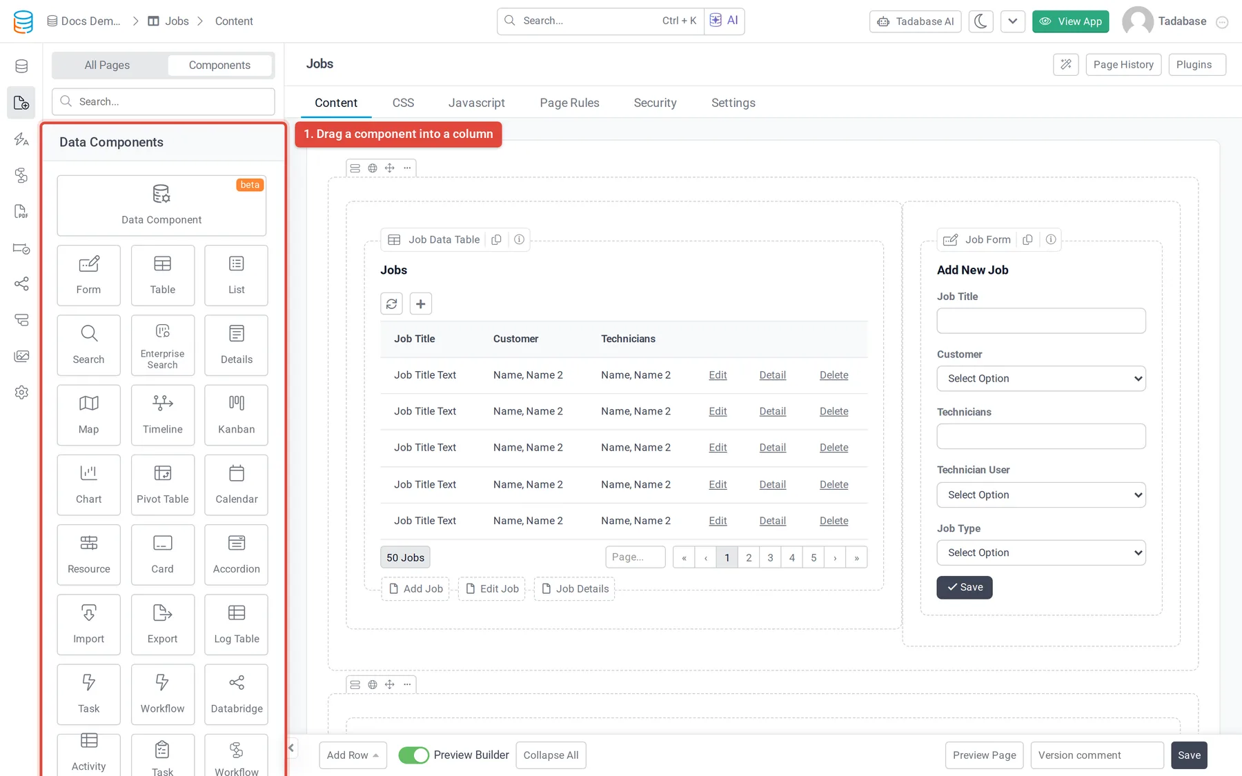
Data components #
| Component | What it does | Shown when |
|---|---|---|
| Data Component | One component that can be shown as a table, list, cards and other designs, marked beta. | Your plan includes it |
| Form | Add or edit records. | Always |
| Table | Records in rows and columns. | Always |
| List | Records as a list of blocks. | Always |
| Search | A search form with its results. | Always |
| Enterprise Search | Search across fields with filters and themes. | Always |
| Details | The fields of one record. | Always |
| Map | Records with an address on a map. | Always |
| Single Map | The address of the page's record on a map. | On record (child) pages |
| Timeline | Records along a timeline. | Always |
| Kanban | Records as cards in columns. | Always |
| Chart | Charts of your data. | Always |
| Pivot Table | Grouped and summarized data. | Always |
| Calendar | Records with dates on a calendar. | Always |
| Resource | Records scheduled against resources. | Always |
| Card | A number or summary in a card. | Always |
| Accordion | Records in collapsible sections. | Always |
| Import | Lets users import records from the live app. | Always |
| Export | A button that exports records. | Always |
| Log Table | Shows one of the app's log tables, such as user login logs, as a table. | Always |
| Task | A button that runs one of the app's older tasks. | Always |
| Workflow | A button that runs a workflow. | Workflows are on for the app and in your plan |
| AI Prompt | Runs an AI prompt from the page. | Your plan includes AI prompts |
| Task Manager | View, monitor and run the app's tasks. | Your plan includes the task dashboard or task calendar |
| Workflow Manager | View and run the app's workflows. | Workflows are on for the app and in your plan |
| Custom | A component built from your own template. | Your plan includes custom components |
System components #
| Component | What it does | Shown when |
|---|---|---|
| Menu | Navigation links to your pages. | Always |
| User Menu | The signed-in user's name with profile and logout links. | Always |
| Breadcrumbs | The trail of pages above the current one. | Always |
| PDF Print | A button that prints or downloads the page as a PDF. | PDF pages are on for the app |
| Link Button | A button that opens a page or address. | Always |
| Login | A sign-in form. | Always |
| Signup | A registration form. | Always |
| Profile | Lets signed-in users edit their own details. | Always |
| HTML | Your own text and HTML. | Always |
| Image | A picture. | Always |
| Subscription and My Subscription | Sell subscriptions to your users with Stripe, and let them manage theirs. | Your plan allows subscriptions and Stripe is set as the app's subscription service |
Add a component #
- Have a column ready Components go in columns. If the page has no room, click Add Row at the bottom of the Content tab and choose how many columns.
- Place the component Drag a component from the Components tab into a column. Or click Add Component in an empty column (it changes to "Select a component from the left") and then click the component you want.
- Set it up Click the component on the page to open its settings and choose its data source, fields and options.
- Save the page Click Save at the bottom of the Content tab.
Edit, move and copy a component #
- Edit: click the component on the page to open its settings. Click Update & Close (or Update & Save) to keep your changes.
- Move: hover over the component and drag it by its name bar to another column, on the same row or a different one.
- Copy to another page: hover over the component and click the Copy Component icon. In the Copy Component window, choose the page under Select Page To Copy Component and click Copy.
- Find its name for code: the info icon on the component bar shows its id, for example
component_3, for use in CSS or JavaScript. Click it to copy.
Delete a component #
Open the component's settings and click Delete at the bottom, then confirm. Save the page afterwards. If the component opened record pages (for example through a Details link), check those child pages in the page list: you may want to delete them too.
Style a component with the Design tab #
Most components have a Design tab in their settings. Rows and columns have the same Design options, so you can style a whole row at once.
| Tab | Options |
|---|---|
| Fonts | Font Family, Size, Color, Line Height and Alignment. |
| Background | Background Color, Repeat and Background Size. |
| Border | Width, Style (such as Solid, Dashed or Dotted) and Border Color, for all sides or one side. |
| Spacing | Margin and Padding for each side. Enter values with units, for example 25px. |
| CSS | Additional CSS Classes and Additional CSS for this item only. |
| Theme | A ready-made look. Shown for forms and for Enterprise Search. |
Was this page helpful?
Something wrong or missing on this page? Tell us.