
Let users search records
Add a Search component that filters the tables, lists and other components on the same page by the fields you choose.
- Verified Nov 17, 2026
- Classic builder
On this page
The Search component adds a search form to a page. When someone searches, the matching records appear in the other components on the same page that use the same data table, such as a Table or a List.
For grouped AND/OR conditions, optional fields and saved searches, use Enterprise Search instead.
Where the results appear #
The Search component does not list records itself. It filters other components on the same page that use the data table it searches. These components can show its results: Table, List, Card, Accordion, Calendar, Timeline, Kanban, Resource, Chart and Custom components.
So before you add the search form, add the component that will show the results, for example a Table of Jobs. You choose which of these components the search updates on the Search Results tab.
Add a Search component #
- Add the results component On the page, add a Table, List or other data component for the table you want to search. See Data components.
- Add the Search component In the Page Builder, click Add Component in a column and choose Search under Data Components.
- Choose the table Under Which table should this component search?, pick the data table, then click Customize.
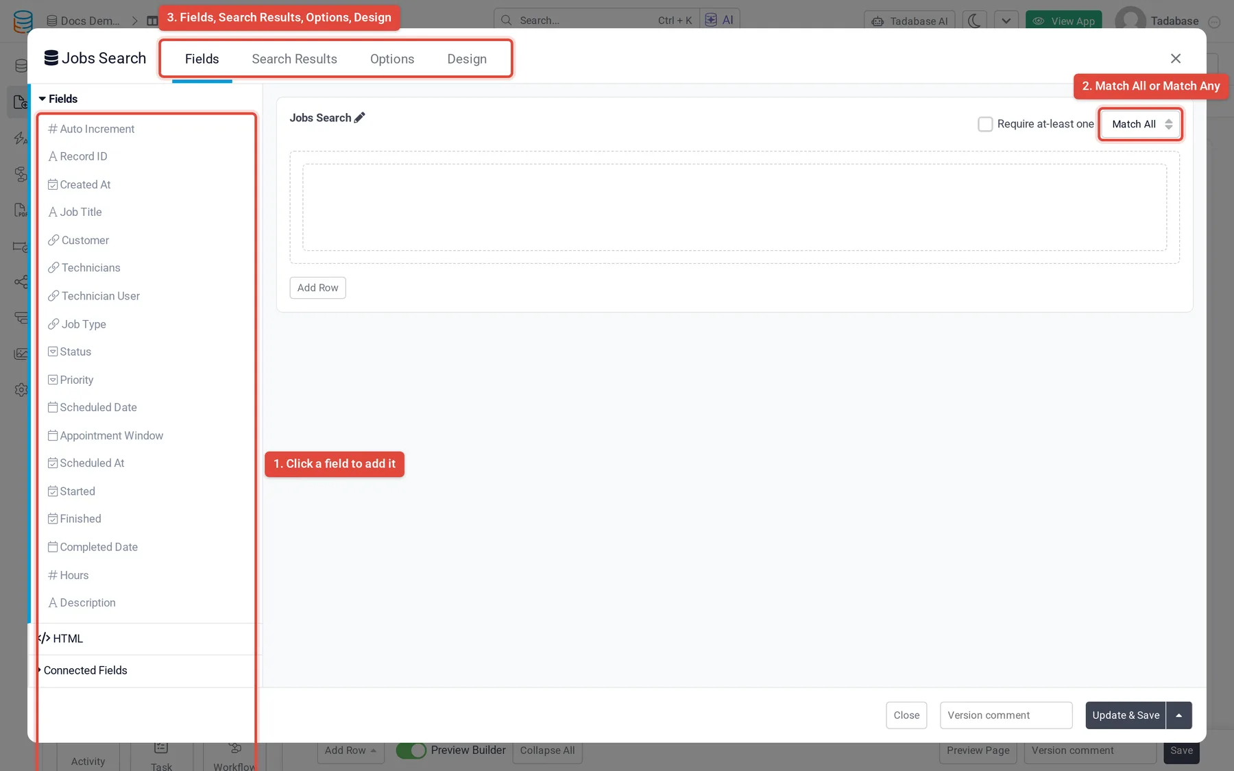
- Add the search fields On the Fields tab, click a field in the Fields list to add it to the form. Fields from connected tables are under Connected Fields, and HTML adds a block of text. Drag fields to arrange them in rows and columns.
- Choose the results On the Search Results tab, tick each component the search should filter. Tick Only Load Upon Search under a component if it should stay empty until someone searches.
- Save Click Update & Save.
How fields are combined #
Above the form on the Fields tab:
| Setting | What it does |
|---|---|
| Match All / Match Any | Match All (the default) shows records that match every field the person filled in. Match Any shows records that match at least one. |
| Require at-least one | The search only runs when at least one field has a value. |
Change a search field #
Click a field in the form to open its settings. The General tab has these options:
| Option | What it does |
|---|---|
| Title and Help | The label above the field and the help text under it. |
| Required | The person must fill in this field before searching. |
| Operators | Enable All (the default) lets the person pick any operator for the field, such as "is" or "contains". Select Operators limits the list to the operators you pick. Pre-defined fixes one operator and hides the operator list. |
| Get Value From URL | Shown when Operators is Pre-defined. Fills the field from a URL parameter; see below. |
| Join Value | For connection fields: show the connected records as a Drop Down or let the person type (Text Input). |
| Total Records to load | For a connection field shown as a dropdown: how many records load when the form opens. Others are looked up as the person types. |
| Style | For Decision Box fields: Dropdown or Checkbox. |
| Limit to ... Logged-In User is connected to | For connection fields, when the logged-in user's table connects to the same table: only offer records connected to the logged-in user. |
A connection field also has a Filter Record tab, where you add rules that limit which connected records are offered. The Label tab sets the label's text size, color, icon, position and CSS class.
Run a search from a link #
You can fill a search field from the page's URL, so a link opens the page with the search already run.
- Fix the operator Open the field's settings and set Operators to Pre-defined, then choose the operator.
- Turn on the URL value Turn on Get Value From URL and enter a Parameter Name, for example
status. - Build the link Add the parameter to the end of the page's URL, for example
?status=Open. Separate several parameters with&:?status=Open&city=Boston.
When the page opens with the parameter, the field is filled in and the search runs.
Buttons and labels #
The Options tab sets the buttons and the label layout:
| Group | Options |
|---|---|
| Search Button Options | Submit Button Text (default Search), Search Button Icon and Search Button Style: Success (default), Danger, Warn or Link. |
| Clear Button Options | Clear Button Text (default Clear), an icon, and Clear Button Style (default Link). |
| Field Label Options | Label Position: Top, Right, Bottom or Left. With Left or Right, Label Column Size sets how wide the label is. |
The Design tab sets fonts, background, border, spacing and CSS for the component, like other components.
Common problems #
| What you see | What to do |
|---|---|
| Search Results says No searchable components were found on the page | Add a Table, List or other data component for the same data table to the page, then open the Search component again. |
| Searching does not change a table on the page | The table uses a different data table, or it is not ticked on the Search Results tab. |
| Clicking Search with empty fields does nothing | Require at-least one is on. Fill in at least one field. |
Was this page helpful?
Something wrong or missing on this page? Tell us.