
Find your way around the Page Builder
Open the Page Builder, find your layouts and pages, use the page tabs, arrange rows and columns, and save your changes.
- Verified Nov 17, 2026
- Classic builder
On this page
The Page Builder is where you design the live app your users see. You build pages out of rows, columns and components, and you wrap pages in layouts that hold the shared header, menus and footer.
Open the Page Builder #
In the builder, click the Page Builder icon in the left bar. The panel next to it has two tabs:
- All Pages: your layouts and pages, with Add Page and Add Layout above the list.
- Components: the components you can drag onto the open page or layout. See Add, move and style components.
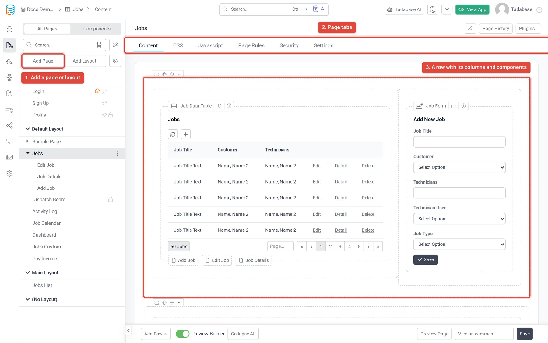
The list of layouts and pages #
Under All Pages the list is grouped like this:
- Default Pages: the Login, Sign Up and Profile pages every app starts with. They are marked with a pin icon and cannot be copied or deleted.
- One group per layout, with the pages that use it listed under it. Record pages (child pages) are nested under the page they belong to.
- (No Layout): pages shown without a layout.
Icons next to a page tell you about it: a lock means only logged-in users can open it, a house marks the home page, and a red dot means the page is inactive.
Use the search box to find a page by name. The filter button next to it has Filter By Layout, Filter By Role and a switch to show each page's slug. The gear button next to Add Layout has Show Stats, Collapse All, Expand All and Show Slug.
Each page and layout has a three-dot menu that jumps straight to one of its tabs, plus Copy and Delete.
Page and layout tabs #
When you open a page or layout, its name appears at the top with a row of tabs under it.
| Tab | On | What it is for |
|---|---|---|
| Content | Pages and layouts | The rows, columns and components. This is where you spend most of your time. |
| CSS | Pages and layouts | Styles for this page or layout only. See Add CSS and JavaScript to a page or layout. |
| Javascript | Pages and layouts | Code that runs when this page or layout loads. |
| Page Rules | Pages | Conditions checked before the page loads. See Run page rules before a page loads. |
| Security | Pages and layouts | Who can open it. See Control who can open a page or layout. The Login and Sign Up pages do not have this tab. |
| Settings | Pages and layouts | Name, slug, layout, home page, status and more. See Add, organize and delete pages. |
Rows and columns #
The Content tab is a grid. A row runs across the page and is split into columns, and components sit inside columns. Each row is 12 units wide: a column of 12 fills the row, two columns of 6 split it in half, and so on. On narrow screens, columns stack.
- Add a row Click Add Row at the bottom of the Content tab and choose 1 Column, 2 Columns, 3 Columns, 4 Columns or 6 Columns. Choose Row Separator to add a horizontal divider instead. The new row is added at the bottom.
- Work with a row Hover over the row and open its three-dot menu: Edit, Add Row Above, Add Row Below, Add Column Inside and Delete. Drag the move icon to put the row somewhere else.
- Work with a column Hover over the column and open its three-dot menu: Edit, Tabs, Add Column Left, Add Column Right, Resize (from 1/12 to 12/12) and Delete. Drag the column's move icon to move it.
- Add a component Click Add Component in an empty column and then pick a component from the left panel, or drag a component from the Components tab into a column.
Deleting a row or column also deletes everything inside it. Tadabase asks you to confirm first.
Row and column settings #
Choose Edit in a row's menu to open its settings:
- Row Name: a label shown on the row in the builder.
- Visibility: Public, Any Logged In User, Non Logged In Users or Specific Logged In User Roles. Use it to show a row only to some users.
- Row Container: Fixed keeps the row to a set width; Fluid stretches it across the browser window.
- Design: fonts, background, border, spacing and CSS for the row.
Choose Edit in a column's menu to set its Column Width separately for Large(LG), Laptop(MD), Tablet(SM) and Phone(XS) screens, hide it on some screen sizes under Visibility, or change its Design. Choose Tabs to split the column into tabs: add a tab with Add New Tab, give each a Title, and pick the Default tab.
Preview Builder, Collapse All and Preview Page #
- Preview Builder (switch at the bottom of the Content tab): when it is on, components show a preview of their content in the builder. Turn it off for a simpler view.
- Collapse All and Expand All: fold rows away when a page is long. Shown while Preview Builder is on.
- Preview Page: opens the page in your live app in a new tab.
Save your changes #
Changes on the Content, CSS and Javascript tabs are not saved until you click Save at the bottom right. While there are unsaved changes, an Unsaved Data notice shows next to the buttons. If you try to leave, the builder asks "You have unsaved changes. Are you sure you want to leave?"
The Settings tab shows Unsaved Changes with Discard and Save when you change something there.
If your plan includes page history, a Version comment box sits next to Save. What you type there is shown in the page history. See See page history and restore a version.
Was this page helpful?
Something wrong or missing on this page? Tell us.