
Schedule people and assets with the Resource component
Add a Resource scheduler that shows records over time in one row or column per resource, such as jobs per technician, and lets people drag them.
- Verified Nov 17, 2026
- Classic builder
On this page
The Resource component is a scheduler: it shows records on a time grid with one row or column per resource, such as one row per technician with that technician's jobs placed at their dates and times. Use it to see who or what is booked when, and to move bookings by dragging them.
Before you start #
- The table of bookings needs a Date, Date/Time or Date Range field, for example a Jobs table with a Scheduled date range.
- It also needs a field that names the resource, usually a connection to the people or things being scheduled, for example a Technician field on Jobs that connects to the Technicians table.
- The Resource component depends on your plan. If your plan does not include it, its settings window shows an upgrade button instead of the add buttons.
Add a Resource component #
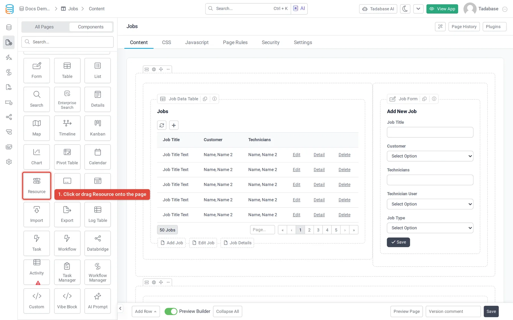
- Open the page In the Page Builder, open the page and its Content tab. Click the Components tab in the left panel.
- Add the Resource Under Data Components, click Resource or drag it into a column.
- Choose the bookings Answer Which records should this calendar display? by selecting the bookings table, for example Jobs. Only tables with a date field are listed. See Choose which table and records a component shows.
- Quick Add or Customize Click Quick Add to add it with a date field picked for you, or Customize to set it up first.
- Set the resource and dates On the Options tab, set Resource Field, Date Field and Label Field (described below).
- Save Click Update & Close.
The settings window has these tabs: Data Source, Detail View (when the detail popup is on), Form View (when the add form is on), Event Label Color Rules, Filters, Options and Design.
Resource options #
| Option | What it does |
|---|---|
| Show Resources | Horizontal (the default) lists the resources down the left with time running across, and offers day, week and month views. Vertical puts each resource in its own column with time running down, and offers day and week views. |
| Resource Label Text | Horizontal only. The heading above the list of resources, for example Technicians. |
| Label Field | The field shown as each booking's text, for example the job title. |
| Date Field | The Date, Date/ |
| Resource Field | The field whose value decides the row or column a booking goes in, for example the Technician connection. |
| Resource Group Field | Horizontal only. Groups the resource rows under headings by a field, for example by team. |
Let people open, move and add bookings #
| Option | What it does |
|---|---|
| Enable Drag/ | People can drag a booking to another time or another resource, or drag its edge to change how long it lasts. The record is updated. |
| Enable Detail View in Popup | Clicking a booking opens the record's details in a popup. Choose its fields on the Detail View tab that appears. |
| Enable Form to Add Additional Records | Clicking an empty slot opens a form to add a booking at that time. Choose its fields on the Form View tab that appears. Not offered when Date Field is the record's created date. |
Set how it opens #
| Option | What it does |
|---|---|
| Default Display Field | The period shown first: Day (the default), Week or Month. A Vertical layout shows Week when Month is chosen. |
| Default Event Color | The color of bookings that no color rule matches. |
On the Event Label Color Rules tab, click Add New Color Rule to color bookings that match conditions, for example urgent jobs in red.
Filter the bookings #
- Data Source > Filters: click Add New Filter Group to show only some records. See Choose which records a component shows.
- Filters: turn on Filter Tabs to show tabs that people click to filter the bookings.
The Design tab sets the component's fonts, background, border, spacing and CSS.
Was this page helpful?
Something wrong or missing on this page? Tell us.