
Use a Data Component template
Add a Data Component: pick a ready-made design from the template library, connect it to your data and set its options in a live preview.
- Verified Nov 17, 2026
- Classic builder
A Data Component starts from a ready-made design in the template library, such as a styled table, list or card layout, instead of a blank component. You connect it to your data and adjust it in a live preview.
Add a Data Component #
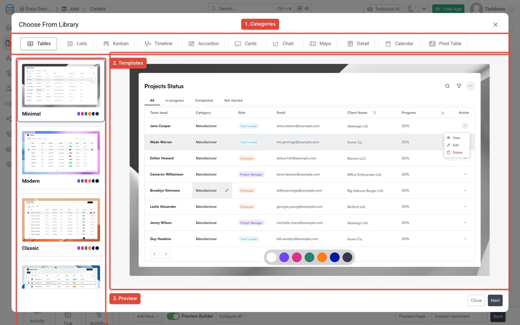
- Open the library In the Page Builder, click Add Component in a column and choose Data Component. The template library opens.
- Pick a template Choose a category from the tabs across the top, then a template on the left. The preview on the right shows it; if the template has color styles, click a color dot to see each one. Click Next.
- Answer the starting questions The template asks what it needs to get started, such as which data table to show. If the template can also show data from another service, choose Tadabase Data Table or External Source first. Click Next.
- Set the options Adjust the component in the editor (see below).
- Save Click Update & Save, or use the arrow next to it for Update & Close.
Use Previous to go back a step, and Refresh to reload the library.
The editor #
The editor shows a live preview of the component on the left and its settings on the right.
| Part | What it does |
|---|---|
| Desktop, Tablet, Mobile | The buttons above the preview show it at each screen size. |
| Preview: | Switch between Records Screen (the component with records) and No Record Screen (what shows when there are none). |
| ... Options | The name of the component you are editing. Some templates contain more than one component, for example a table with a details view; pick which one to edit from the arrow next to the name. |
| Tabs | The settings are split into tabs, and each tab into sections you can open and close. Which tabs and settings there are depends on the template. |
| Section switch | Some sections have a Section Visibility switch that turns that part of the component on or off. |
Start every new component from a template #
In your app's general settings, Use App Data Component Defaults makes new components open the Data Component library by default. Choose the Theme Type to use. Components added to PDF pages are not affected.
Pivot tables #
To group and total records, use the Pivot Table component. See Summarize data with a pivot table.
Was this page helpful?
Something wrong or missing on this page? Tell us.